The task
We already had a consultant bot that has been answering shoppers in a real electronics store for a year, and a second bot that handles bookings for nail and hair professionals. What we did not have was a page to send a person to from a cold email. A store owner or a beauty professional does not want to read about “AI”. They need a minute to understand three things: what the bot does, what it costs and where to try it.
One more condition: two very different products, a $1,200 bot for a store and a $10-a-month bot for a professional, must not mix on one page. Hence a hard switch at the top, “For stores / For professionals”, and two languages, Ukrainian by default and English.
Why, and what the idea was
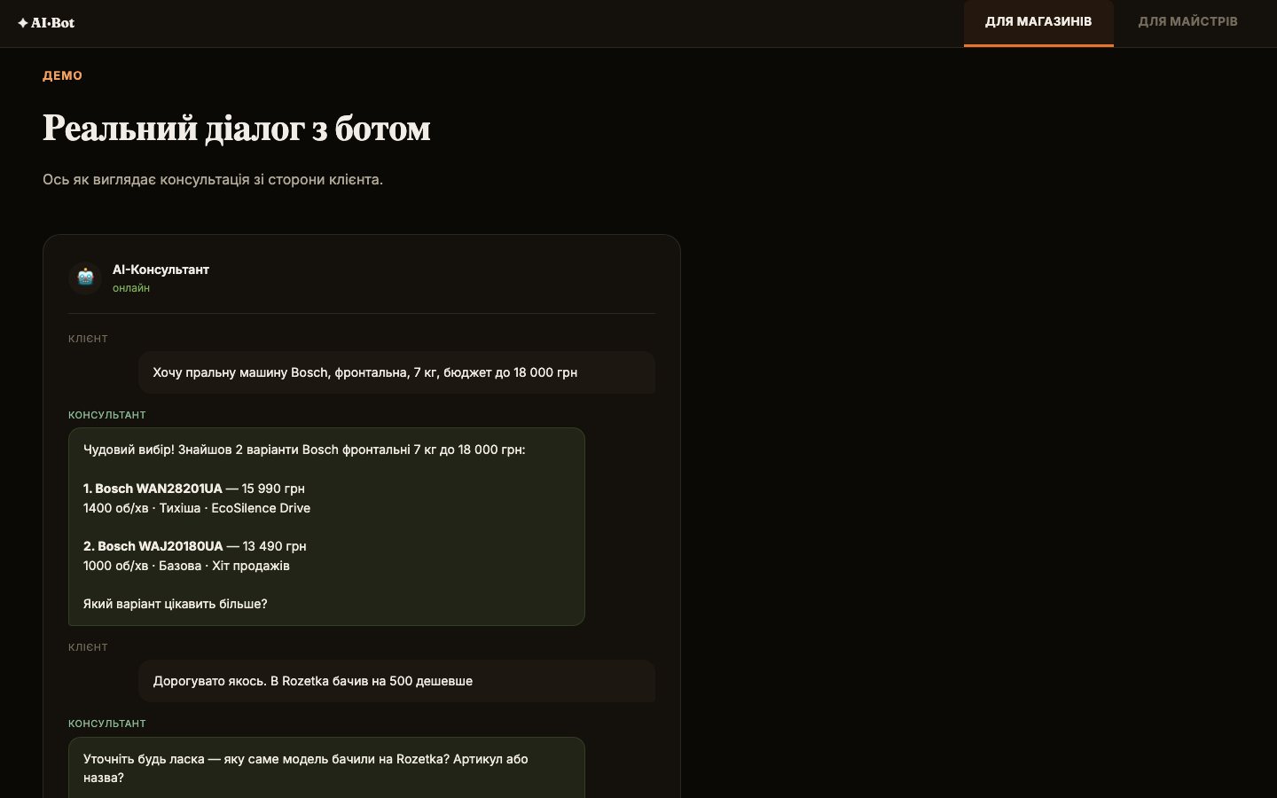
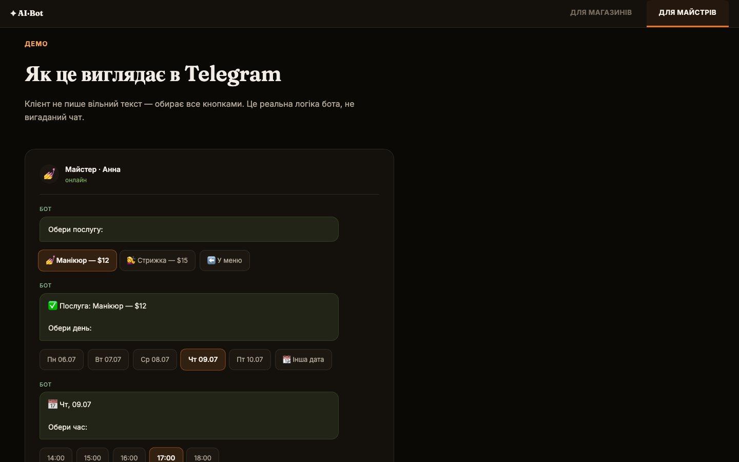
Every page has a live button into the real bot, a sample dialogue and pricing without asterisks. For the store it is a conversation about a Bosch washing machine under 18,000 UAH with the objection “it is cheaper on Rozetka”. For the professional it is button-driven booking: service, day, time, confirmation, exactly the way the real bot works.
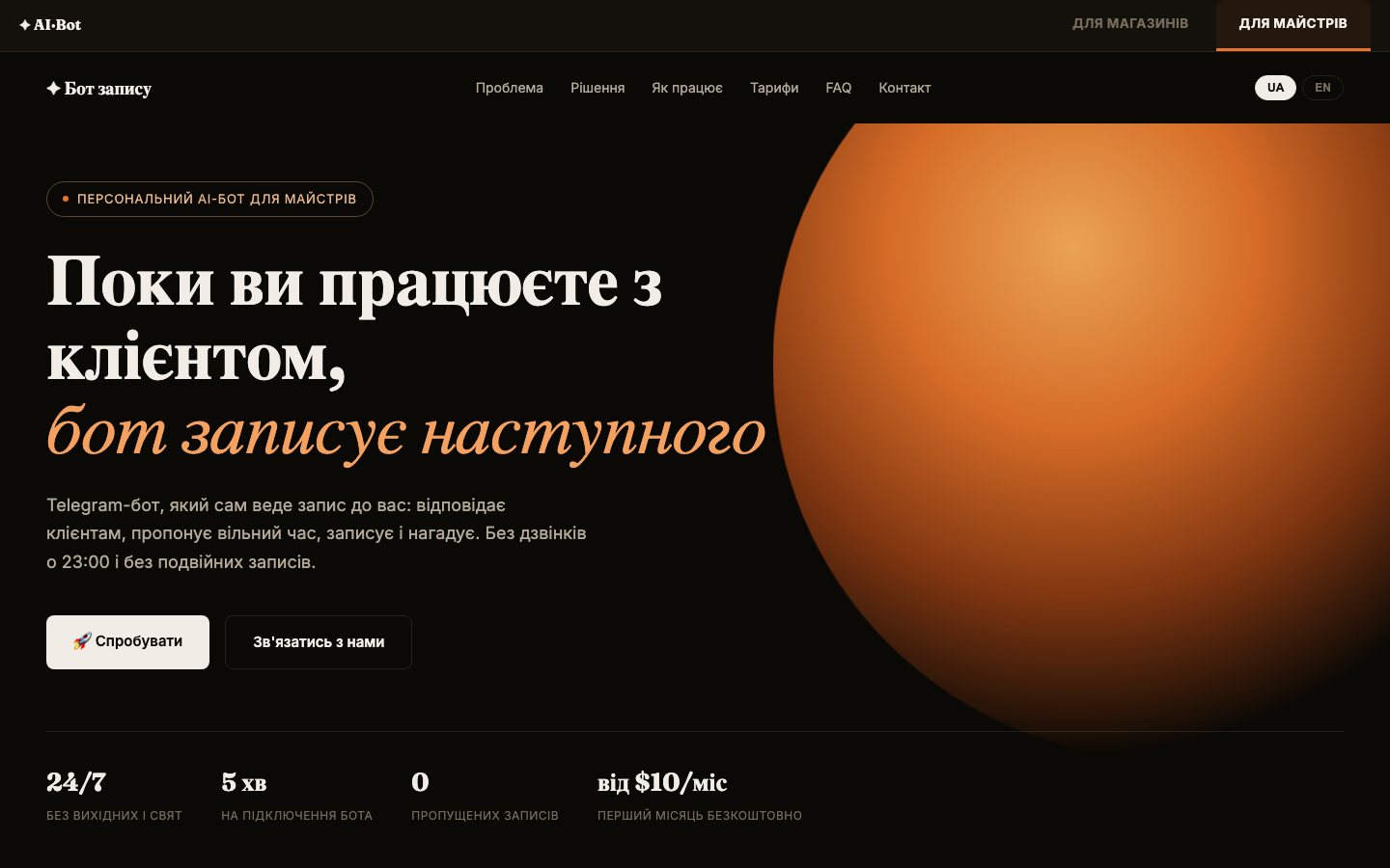
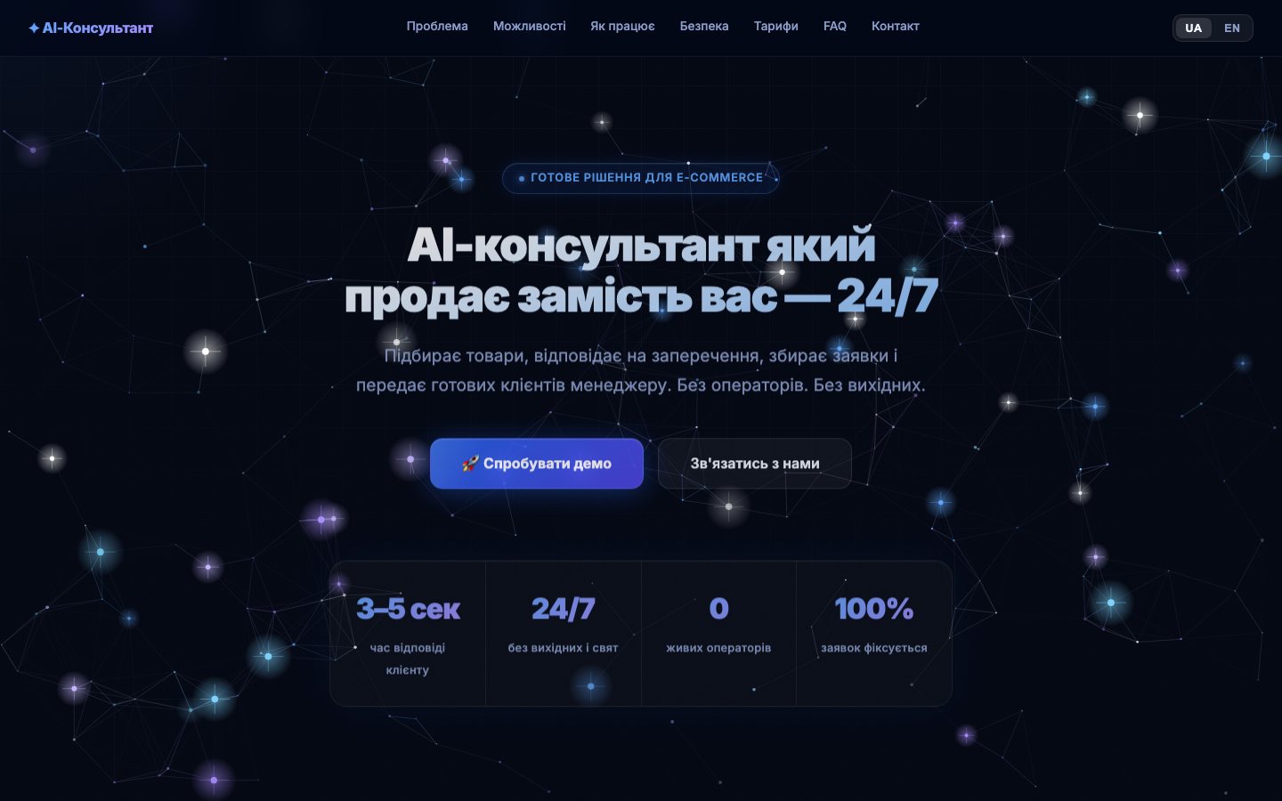
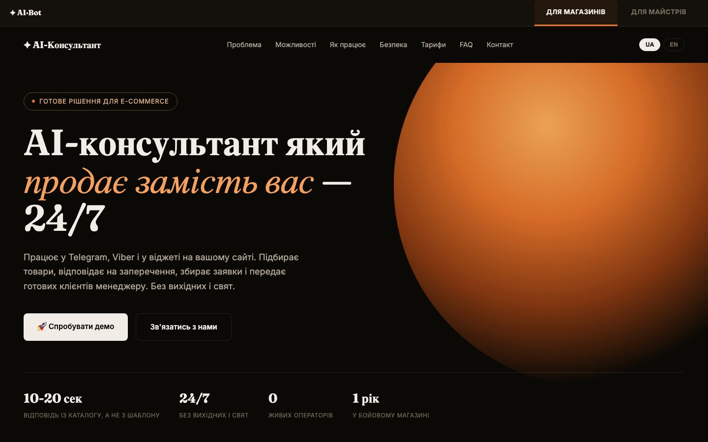
The style took a while. Dark Tech, Minimalism, Bento, Neobrutalism, Editorial, Neon Glass: every mockup was rejected because it looked like a generic AI template. The direction came only from real references: the editorial serifs of Kove, the colored cards of Cargoscope, the warm glow on a dark background in the Obsidian landing on Saaspo. That became Premium Dark Editorial: a near-black background, an orange glowing orb that breathes through a CSS animation and follows the mouse, Fraunces headlines, Inter body text, muted cards. A later 3D redesign with an underwater world was rejected too.
The second idea came later and turned out to be the main one: the site must promise exactly what the product does. A corporate reader catches contradictions at once, and any number that cannot be shown in the logs works against us in a meeting.
How it went
| When | What happened |
|---|---|
| Stage 1 | Pricing: a “Purchase / Subscription” switch, a comparison of three models, about 70 new keys in the translation dictionary, a site icon |
| Stage 2, a week later | Council on pricing: a client could not see the difference between an $89 subscription and a $1,200 purchase. A “Priority” tier with clear differences added |
| Stage 3, ten days later | Redesign. Several rounds of mockups rejected, the style found through references. We replaced the style block entirely and left the 770 lines of content and the dictionaries as they were |
| Stage 3, the same day | New /masters page. Three council rounds on a preview link, then release to the live domain |
| Stage 4, the next day | Clean URLs without .html and a fix for the site looking “cut off” on wide monitors |
| Stage 5, six weeks later | Promises the product does not keep removed: unlimited, “3 stores in one bot”, CRM, Enterprise with code handover |
| Stage 6, a month after that | A client found a dead demo, fixed the same day. Then a big cleanup by council: pricing into one path, the “Security” block made truthful, the broken English fixed |
How decisions were made. On disputed parts we convened a council: five AI advisors (a skeptic, an architect, a visionary, an outsider, a pragmatist) review the work independently, then review each other. The redesign took three rounds. The first found 7 problems: the product switch was too small, on /masters a single pricing card hung in empty space, the orb on the first screen was dead, the reveal animations did not work, the pricing cards had different heights. In the second round 4 of 5 said “satisfied” at once, the fifth could not verify that the orb follows the mouse. We checked by hand with dispatchEvent('mousemove'): it works, that was a limitation of the tool. The third round went by direct remarks.
Tools and method
No framework. Each page is one self-contained HTML file with the markup, styles, scripts and translation dictionaries inside, plus a shared styles.css. The home page is about 100 KB, the professionals page about 41 KB. Every label lives in two places: in the HTML and in the window.__i18n dictionary with uk and en keys, elements are marked with data-i18n, and on load the dictionary overwrites the HTML.
Hosting on Vercel, own domain, released with vercel --prod from the folder. vercel.json turns on clean URLs, .vercelignore keeps backups and drafts out of the release. There are no keys and no money on the site: it is a showcase, no API calls from the page, every button leads to Telegram or to the contacts.
Checks before a release: the page scripts are extracted and run through node --check, tags are checked for pairing. After a release: curl of the live domain and a count against a list of phrases, the new ones appeared, the old ones are gone, backups return 404. Separately we checked that both bots are alive: the service runs, getMe answers, the queue is empty.
Result
Home page, for stores. First screen: “An AI consultant that sells instead of you, 24/7”, a button into the live bot and four numbers: a reply in 10-20 seconds, 24/7, 0 human operators, 1 year in a live store. Then: why stores lose customers, what the bot can do, a sample dialogue, how setup goes, security, pricing, what the price is made of, bot versus human operator, FAQ, contacts.
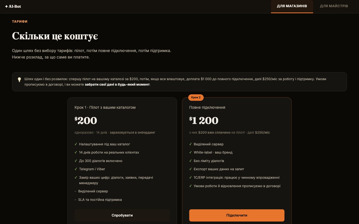
Store pricing after the cleanup: one path, no choice to make. A $200 pilot for 14 days on the store’s own catalogue, up to 300 dialogues. If it works for you, a $1,000 top-up to full setup, then $250 a month. If the pilot did not work out, you pay nothing more. Below it, a transparent breakdown of where the money goes: Claude API, server, setup, support.
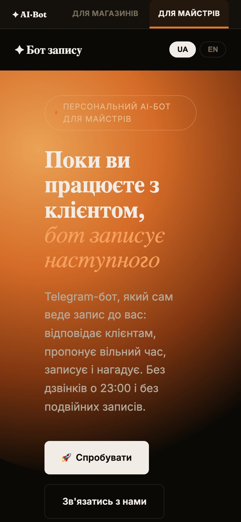
The page for professionals. The professional’s pain (calls at 11 pm, missed bookings), what the bot does, setup in 5 minutes, how it looks in Telegram, $10 a month and the first month free. Next to it a card “A salon with several professionals?” with an honest “format in development”.
What it brought. The first corporate inquiry came through the site: the person received an email, opened the page, took the contact from there and asked questions of substance: for what period, by what criteria, is there an API for dialogue history. Later they replied that they were studying the materials in detail.
What we do not know and what is still undone. We did not measure the site’s conversion, there is no analytics on the pages, we did not count inquiries from the site. Paying clients from the professionals page so far: zero, the bot’s database has 5 professionals and 0 payments. The home page’s first screen still promises “a widget on your site”, although the widget was removed from the promises, the decision is the owner’s. On a phone the first-screen subtitle sits on the bright glow and the contrast is weak.
Mistakes and what we took from them