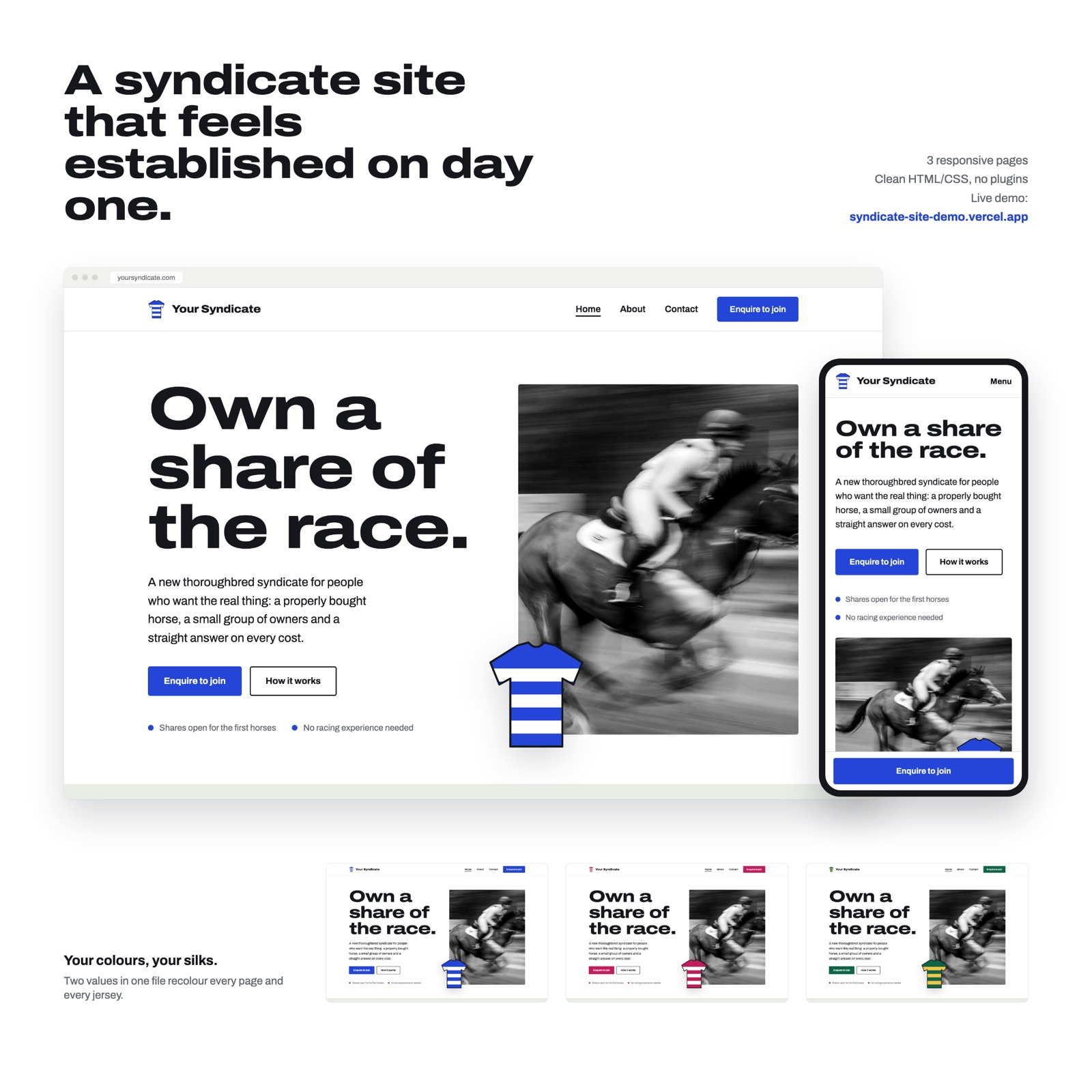
The task
The client is launching a racehorse syndicate from scratch and wanted a three-page website: home, About and Contact. The form should ask only for a name, email and phone. The brief said it outright: modern typography, plenty of air, no “tweed and turf”. At the same time there was no logo, colors or photos at the start, the files tab was empty, everything was promised later.
Hence two tasks. First: everything brand-related has to be a placeholder that is easy to replace. Second: do not invent “17 Group 1 wins” and testimonials for a syndicate that does not exist yet, and build trust with honest things instead: how joining works, what a share includes, what happens to the form data.
A platform constraint: this brief accepts only PNG, JPG and GIF. We built a working site anyway and put a link to it in the description, to stand apart from the collages.
Why, and what the idea was
First we looked at what the client wants, not at what others do. Within 4 hours of the start 86 entries came in, and the grid was dark blue and dark green with gold buttons and an AI jockey at sunset. We decided that this was the same “tweed and turf” in new wrapping, and went light: an editorial site with a single accent color.
Then we looked at real syndicates: westpointtb.com, myracehorse.com, highclereracing.co.uk, australianbloodstock.com.au. All share one skeleton: available horses, what a share includes, how to join step by step, who is behind the syndicate, an FAQ about money and one button. Our modest content fits this skeleton without inventions.
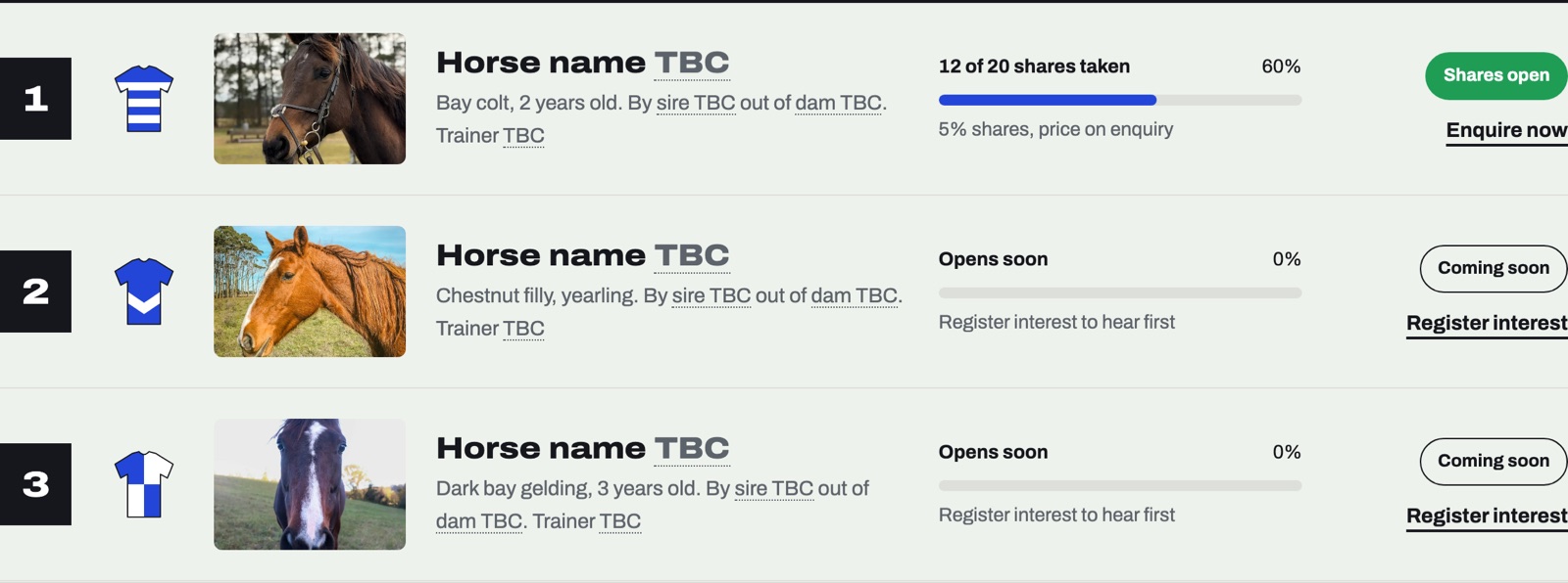
The main idea: a site in the style of a racecard. The brand color paints the jockeys’ silks, every horse has its own “Register interest” button, and the button opens the form with that horse already selected. What we borrowed from the leaders we did better: the calculator in one of the entries was a picture with made-up numbers, ours works on the live site and is honestly labelled as approximate.
How it went
| Stage | What happened |
|---|---|
| Stage 1, research | The brief, the client, formats. 86 entries within 4 hours of the start, nearly all dark with gold. Decision: a light editorial site with one accent and PNG boards |
| Stage 2, about a quarter of an hour | Picked photos on Unsplash, built site v1 and 4 boards, deployed the demo on Vercel |
| Stage 3, review | 4 reviewers went through 83 open entries out of 93 and opened 130 mockup fragments. All four agreed: the black-and-white photo is grey in the thumbnail, the cover shows only the home page, there is no share economics and no reassuring lines near the form |
| Stage 4, another quarter of an hour | Version v2: a color photo, three pages and three phones on the cover, shares per horse, the calculator, trust near the form, a disclaimer, a fifth board. Demo updated and checked |
| Stage 5, submission | Entry #101: 5 PNGs, a 984-character description with a link to the demo. Checked through the API: status active. 101 entries in the brief at that moment |
| Next | Entries closed, client decision after 5 November |
Tools and method
Plain HTML and CSS plus one main.js, three pages, no build step or plugins. The whole site weighs 1.4 MB. Brand colors live in three variables at the top of styles.css (--silk, --silk-2, --ink). The jockeys’ silks are drawn by a script from those same two colors, so the whole site repaints, jockeys’ kit included. We showed three palettes: cobalt, emerald, cherry. The silk patterns hoops, chevron, quarters, sash and diamond are set by an attribute on each horse.
The form submits through the free Formspree. In the demo it runs in demo mode: validates the fields and shows a “thank you”, but sends nothing. The client needs to insert their form id in two places. Every page has its own title and description, there is a robots.txt and a sitemap.xml. Photos are stock from Unsplash under their free licence, 8 in the final site, all sources in CREDITS.md. The Archivo font under the OFL licence.
Demo on Vercel, the free Hobby plan. For the client, a one-page SETUP.md: how to change the name, logo, colors, photos and horses, connect the form, publish the site and go through the SEO checklist. The submission boards were assembled as a separate HTML page and captured as PNGs 2,400 px wide.
Result
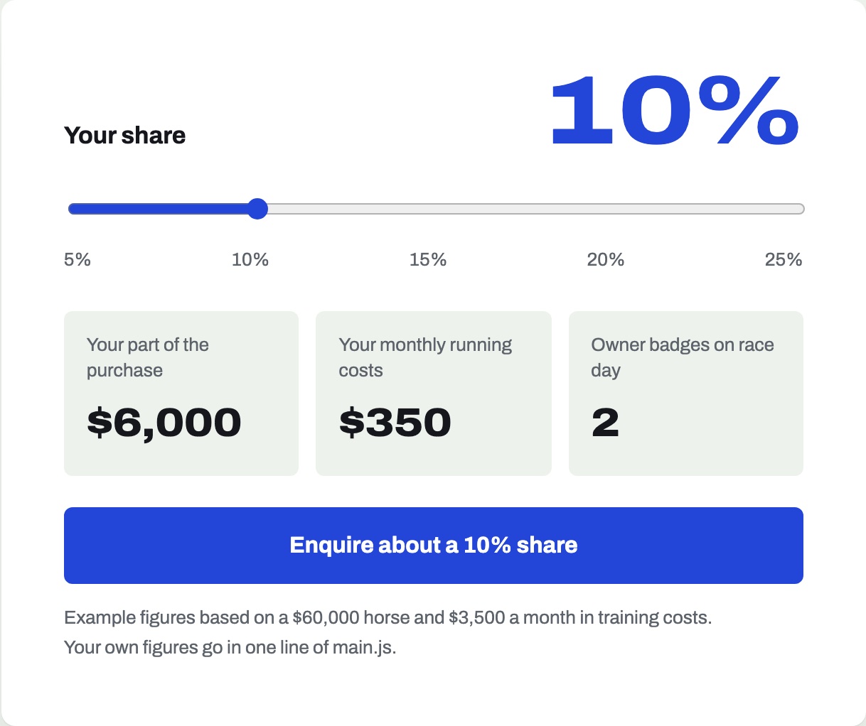
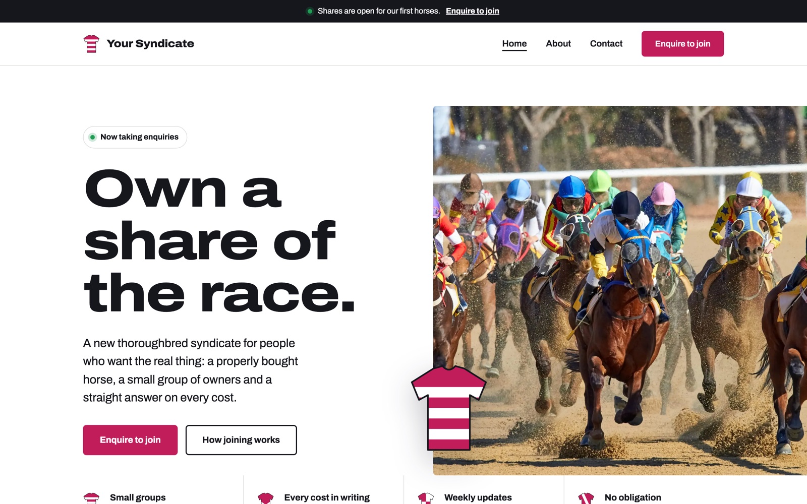
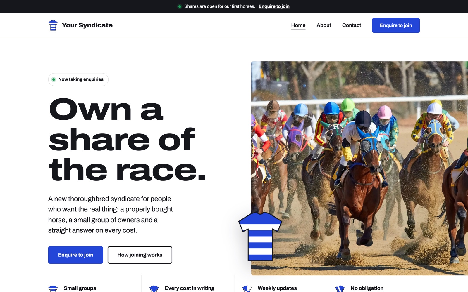
The site works at the link. Home: a color race photo in the header, a “Now taking enquiries” pill, a 4-point trust strip under the header, a “How joining works” block on a band of the brand blue. The racecard: silks, pedigree, trainer, a shares bar, status, a price “on enquiry” and a button for every horse. Share calculator: a slider from 5 to 25%, at 20% it gives $12,000 and $700 a month, the figures are labelled as approximate, the client sets real prices in one line.
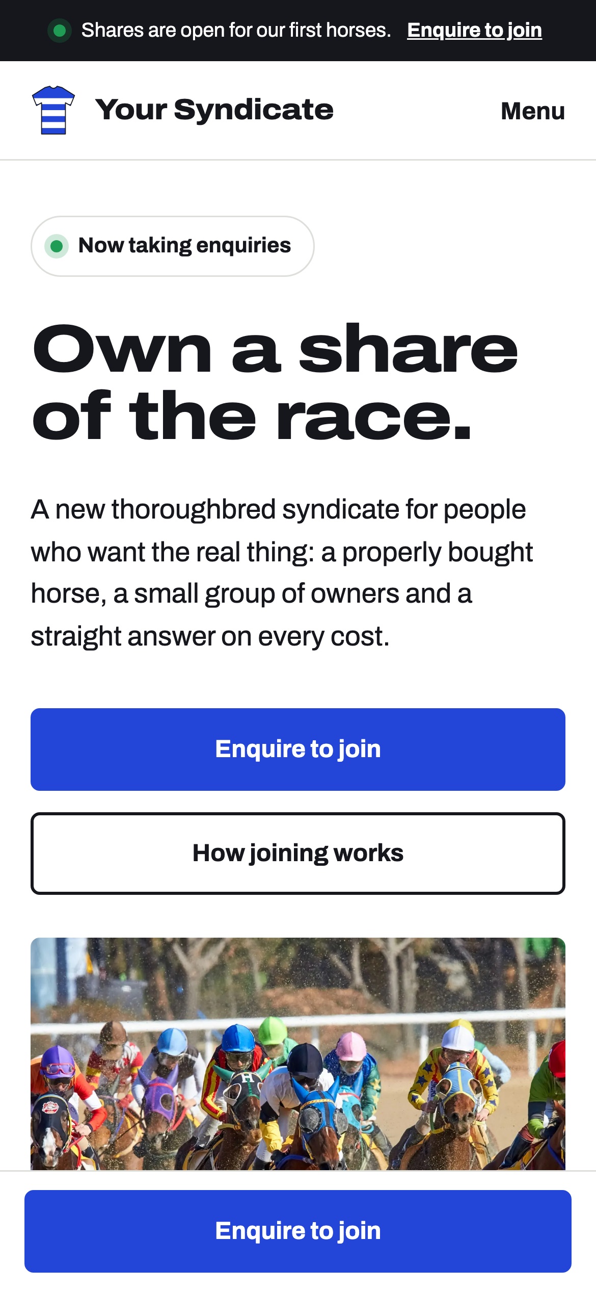
Contact asks only for a name, email and phone. Next to it, trust points, a privacy line, a mini-FAQ, an optional horse selection, a hidden anti-spam field and an “Enquiry sent” screen after submission. In the footer a disclaimer that owning a horse is a sport, not an investment, and that photos are illustrative. On a phone the “Enquire to join” button is pinned at the bottom, the form sits right under the headline, no sideways scroll at 375 px.
What we checked after deploying v2: all pages and photos return 200 in 0.3-0.5 s. The calculator at 20% leads to contact.html?share=20, the share fills into the form, ?horse=2 selects “Horse 2”, field errors and the post-submit screen work.
Against the competitors’ mistakes from the review: we have a mobile version (roughly 61 of 83 entries did not), a light design (roughly 57 were dark with gold), all three pages (roughly 31 showed one), a form with exactly three fields (roughly 23 had extra fields), no invented statistics (roughly 23 entries had inventions).
What we do not know yet: whether the client liked it. At submission time no entry had been rated. The name, horses, prices and number of shares are placeholders, and the calculator figures are approximate. We will add it when the decision comes.
Mistakes and what we took from them